Part 1: https://youtu.be/VHpYWM2fjQE
Part 2: https://youtu.be/NyRih1Kwx0w
Wednesday, 10 May 2017


Monday, 1 May 2017
Photo-shoot Locations
The imagery within my magazine is very important as I have chosen to make a creative regional surf magazine that shows people Cornwall in a modern yet sophisticated way that varies from other regional magazines that have already been created. I n order to get the perfect images for my media products I needed to work out the best places for the target audience I had in mind. Because my primary target audience of 15-25 is lower than the average reader of other regional magazines like Cornwall Today I had to include places that would be of interest to the younger end of my target group but still entice my older readers, therefore I chose to visit and photograph these places.
All of the beach shots and surf photography was shot at Tolcarne and Great Western beach, these images were used on the cover, contents and double page spread.
I also needed images for my website as this would mainly be images as this is what my target audience said that they preferred to see. I visited a range of different locations for these images which included places like;
- Respryn woods, Lanhydrock
- The Eden Project, St. Austell
- Penair Astro, Truro
- Tolcarne beach, Newquay
- Great Western beach, Newquay
- Cardinham Woods, Bodmin
- The Crate Cafe, Bodmin
Shot Types
Front cover
For my front cover image I want an action shot of a surfer riding a wave, therefore I had to research how to take effective outdoor action shots as this was a style of photography that I had not experimented with before. I learnt that in order to be successful I had to plan the exact shots I wanted and I would also have to play around with the exposure and ISO whilst I was there as all shots would be different due to the change in natural lighting and weather conditions. I also had to thing of the range I wanted for my cover shot, with the research i had into pre-existing magazines I chose to go for a mid range/long shot so that the male surfer would be the in the centre of the shot but I would still be able to include some of the extra elements like the waves and blue sky. The magazine front covers that helped influence my choices on this were Wavelength and carve as a common convention for their covers are mid shots.
In very basic terms, ISO is the level of sensitivity of your camera to available light. The lower the ISO number, the less sensitive it is to the light, while a higher ISO number increases the sensitivity of your camera. The component within your camera that can change sensitivity is called “image sensor”. It is the most important part of a camera and it is responsible for gathering light and transforming it into an image.
Cover Image
For my contents page I chose to fully subvert the common conventions and styles that you would typically find on contents pages. Regional magazines tend to have one main image and then a series of extra reduced sized images relating to the stories that would be featured within the magazine, Also although surfing magazines don't have so many extra images on the contents page they do still include a few just to follow conventions slightly. Therefore this would mean that I am breaking magazine conventions rather than just the magazine genre conventions. On my contents you would find an artsy image that follows cubist conceptual conventions as the image is a close up of the water and I have played around with image filters and added extra layers to make the waves into a patterned background for my text.
Double Page Spread
For my double page spread I am going to follow the conventions of magazines by including one main image that will take up on of the pages and the other side will be filled with text. The image itself will be a mid rage/long shot like I have used for my cover image as it has been proven that repetition helps sell a magazine and creates a recognisable brand image. I will take this image with the page layout in mind as the placement of the model within the image can help shape my page and find the best combination of text and image.
Typography Research
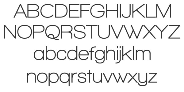
Font: This is a typeface that is specific in size, style and weight. There are a lot of variations between fonts in a magazine but the main variation being the choice of either Serif or Sans Serif. It is important to get the choice of font right as it is one of the main elements in a magazine.
Line Length: This is calculated by the number of characters or words in a sentence. However it refers to the distance of text on the page from the left to right margin.
Typeface: A typeface is the overall group name for fonts. The word typeface refers to a collection of characters, numbers and letters in the same design however is different to the font.
Kerning: Kerning is the spacing between the characters or lettering.
I will mainly use sans serif fonts for my text, however in certain parts on my media products I may have to add a serif font to make some of the text/titles stand out. For the main body of text I will use fonts from sans serif families mainly Helvetica.

Line Length: This is calculated by the number of characters or words in a sentence. However it refers to the distance of text on the page from the left to right margin.
Typeface: A typeface is the overall group name for fonts. The word typeface refers to a collection of characters, numbers and letters in the same design however is different to the font.
Kerning: Kerning is the spacing between the characters or lettering.
My typography will roughly follow the conventions of regional magazines however because my target audience is lower than the average reader of magazines such as Cornwall today, Coast or Cornwall Life I will have to subvert the conventions slightly in order to attract and represent my audience properly. As my magazine also represents surfing in Cornwall I will incorporate conventions and house styles form magazines like Wavelength, Carve and Surf Girl as this would be closer to needs of my audience as their styles are more fresh and modern in comparison to regional magazines.
Contents Page
I am going to follow the common convention of other regional magazines and have the text in a font that is between 5-10pt, I will also have images with page numbers included next to them. I am going to have a more image page contents page however the text will still follow conventions. I think this is best as I set a question in my survey about how they wanted the article to be shown and the majority of responses said that an equal balance or more images would be best.
Double Page Spread
For my double page spread I am going to use a san serif font for the article text and the font colour will be in a contrasting colour to the main image that takes up the other side of the page. Like with the contents page I will stick to the common conventions of a magazine and the text will be between 5-10pt and will be laid out in columns to make the text legible
I will mainly use sans serif fonts for my text, however in certain parts on my media products I may have to add a serif font to make some of the text/titles stand out. For the main body of text I will use fonts from sans serif families mainly Helvetica.

Monday, 24 April 2017
Chosen Institution
As my regional magazine is mainly aimed at 15-25 year olds, I had to find an institution that would have a wide range of existing readers. I found that if I picked an institution with a different target audience to the one that my magazine was aimed at this would form my secondary target audience.


Archant: This company are one of the biggest publishing companies within regional and lifestyle magazines. They mainly distribute magazines in the UK and USA and has a total of 80 titles. They are extremely successful with an average of 3 million readers per month in the UK.
This would be one of the best institutions to distribute my magazine, however another good company would be Orca Publications.
Orca Publications: This company is the institution for loads of well known surfing magazines including one of the most popular titles; Carve. This magazine is extremely well known in Cornwall as there is a high demand for surfing magazines in this region. this is one of the main reasons I have chosen to make my regional surf magazine based in cornwall.
Overall both institutions would work for my magazine, however to be the most successful I have to pick the one that would be able to sell my magazine the best. In conclusion to this I have decided on Orca Publications to be the institution for my regional surf magazine.
Tuesday, 17 January 2017
Website Examples

One thing that I have noticed whilst looking at pre-existing websites is that they all follow a similar colour palette of; blue, white, black and grey. Therefore this has become a common convention I will use whilst creating the website for my surfing magazine. Another convention I will follow is the similar layout patterns, the style of these websites are blocks of images with overlaying text on top of the images. The images are made up of waves and sunset beach settings which makes the viewer want to read the magazine to get a better understanding of these. As a result of this I am going to attempt to take similar images to these and add them to the homepage of my website.
 The website for Carve has a different style as it has one background image and then the centre is filled with the actual website content. I like this concept because it gives the website a subverted look to the regular design of a typical website. My magazine has a subverted style to it as it's different to a regular regional magazine, therefore I may use aspects of this design in my own. The main thing I would change if I were to use this as a reference whilst designing mine would be the colour of the background image, however the content of this website seems to match the image so it could be one of the colours from their colour palette.
 This is my favourite out of the 3 website examples I have looked at, The colour palette is similar to the one I have chosen for my own website. I will also insert a image montage at the top of my website and then lay out the rest of the content I have in little boxes just as Surf girl have done. I may replace the background image with a surf inspired pattern/design, however I will decide this once I have the content of my website is in place so that I can see what work best with the style of my magazine and website.
Tuesday, 3 January 2017
Original Images

These are the images from my beach photoshoot, I like all of these however some didn't work as well as others as a cover image therefore I had to test which ones worked will the colour palette, layout and style of my magazine.
Final Masthead & Title Choice
This is the final design of my masthead, I chose a simple sans serif bold font as this was the common convention of my chosen magazine genre. I think this works well with my main cover image because the white colour is contrasting from the blue water. I also chose this bold font because it stands out from the image and makes the readers eye draw into my magazine.

This was the title for my double page spread, I chose a different font style from the cover because I felt this font worked better with my article and the appearance of my overall page design. I also chose to keep within the colour palette and add the block of colour under the title, this was to keep within common conventions and make sure all three pages link.
Monday, 2 January 2017
Models & Shot list
I have explained the shot types I will use within the magazine in an earlier post however I didn't explain the models and equipment requirements for my images.
The photography for my magazine is quite simple as I don't require any models to pose as such all I need is to go to the beach and take images of people surfing. My ideal photo would be of someone mid wave but facing the camera, this is not the easiest to ensure however I will try my best in order to get the right shot for my articles. I will be using a Cannon 5D with a tripod set up on the beach, I will also be using a 75-300mm lens to get up close to the surfers without walking to close to the water with the equipment. The most difficult part of the photo shoot will be capturing an in focus action shot that will work as a cover image however the tripod should counteract the camera shake.
The photography for my magazine is quite simple as I don't require any models to pose as such all I need is to go to the beach and take images of people surfing. My ideal photo would be of someone mid wave but facing the camera, this is not the easiest to ensure however I will try my best in order to get the right shot for my articles. I will be using a Cannon 5D with a tripod set up on the beach, I will also be using a 75-300mm lens to get up close to the surfers without walking to close to the water with the equipment. The most difficult part of the photo shoot will be capturing an in focus action shot that will work as a cover image however the tripod should counteract the camera shake.
Double Page Spread Article
Big waves carry big responsibilities and Cornwall holds some of the best surfing spots in the country. Many people travel miles to come surfing however, as well as surfing Cornwall is also known for its great food and historic locations, which surround the beaches and attract many tourists. This popular holiday destination holds an annual music and surf festival known as Board masters. Which has had loads of artists come to headline the festival and people come from all over the country to join in. As well as people travelling to Cornwall, many people also travel away from Cornwall to explore different waters and try out their surf competitions. One man in particular Luke Harris has travelled around 14 countries with his surfboard and we've managed to ask him a few questions about his journey. "I've had the time of my life, I've met so many people and tried out so many different wave conditions, however I've still got a lot to learn and I believe that the best wave of your life is still out there, no matter how far you travel and how well you improve I don't think anybody will ever be able to say that was the best wave of my life as the world is changing so much that opportunities and changes are going to male things better".
Heading: Surfing The World
Pull quote: Big waves carry big responsibilities.
Heading: Surfing The World
Pull quote: Big waves carry big responsibilities.
Masthead &Title Ideas
Magazine Masthead Ideas
Within my magazine I have included a double page spread, therefore I had to write an article to feature on the page. I had a few ideas based on the different aspects of my magazine but I resulted back to surfing as this was the main theme running throughout my magazine. I then looked at different surf magazine DPS articles to get inspiration for my own. I decided to look at the different surfing experiences around the work and what it is like to surf whilst travelling, the title I came up with was "Surfing the world" again this would be in a simple sans serif font. I also used a pull quote from within the article which reads "Big waves carry big responsibilities".
- Cornwall Arts
- Creative Cornwall
- Cornwall Creates
Within my magazine I have included a double page spread, therefore I had to write an article to feature on the page. I had a few ideas based on the different aspects of my magazine but I resulted back to surfing as this was the main theme running throughout my magazine. I then looked at different surf magazine DPS articles to get inspiration for my own. I decided to look at the different surfing experiences around the work and what it is like to surf whilst travelling, the title I came up with was "Surfing the world" again this would be in a simple sans serif font. I also used a pull quote from within the article which reads "Big waves carry big responsibilities".
Subscribe to:
Posts (Atom)