Line Length: This is calculated by the number of characters or words in a sentence. However it refers to the distance of text on the page from the left to right margin.
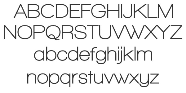
Typeface: A typeface is the overall group name for fonts. The word typeface refers to a collection of characters, numbers and letters in the same design however is different to the font.
Kerning: Kerning is the spacing between the characters or lettering.
My typography will roughly follow the conventions of regional magazines however because my target audience is lower than the average reader of magazines such as Cornwall today, Coast or Cornwall Life I will have to subvert the conventions slightly in order to attract and represent my audience properly. As my magazine also represents surfing in Cornwall I will incorporate conventions and house styles form magazines like Wavelength, Carve and Surf Girl as this would be closer to needs of my audience as their styles are more fresh and modern in comparison to regional magazines.
Contents Page
I am going to follow the common convention of other regional magazines and have the text in a font that is between 5-10pt, I will also have images with page numbers included next to them. I am going to have a more image page contents page however the text will still follow conventions. I think this is best as I set a question in my survey about how they wanted the article to be shown and the majority of responses said that an equal balance or more images would be best.
Double Page Spread
For my double page spread I am going to use a san serif font for the article text and the font colour will be in a contrasting colour to the main image that takes up the other side of the page. Like with the contents page I will stick to the common conventions of a magazine and the text will be between 5-10pt and will be laid out in columns to make the text legible
I will mainly use sans serif fonts for my text, however in certain parts on my media products I may have to add a serif font to make some of the text/titles stand out. For the main body of text I will use fonts from sans serif families mainly Helvetica.

basic research into similar products and a potential target audience.
ReplyDelete